Charts are the language of business, used every day at all levels to convey information. But too often, they’re an incomprehensible mashup of pies, bars, gauges, dots and lines that leaves the reader no more informed about the topic at hand. The good news is it’s almost certainly not your fault — it’s the charts themselves.
I’ve been helping people build better charts for 15 years, through my book, The Big Book of Dashboards, on Chart Chat (a video series about the good and bad of data visualization), and at conferences around the world. I’m a senior data evangelist at analytics platform Tableau, and here’s what I know: data visualization is a language as expressive as the written word, a language that needs to be understood by all but often is not.
I’m endlessly fascinated by the power of data to persuade or inform. Seemingly trivial choices such as color or orientation can completely transform a chart’s message. Check out this two-minute video for a perfect example of how a simple bar chart can be manipulated to tell two completely different stories.
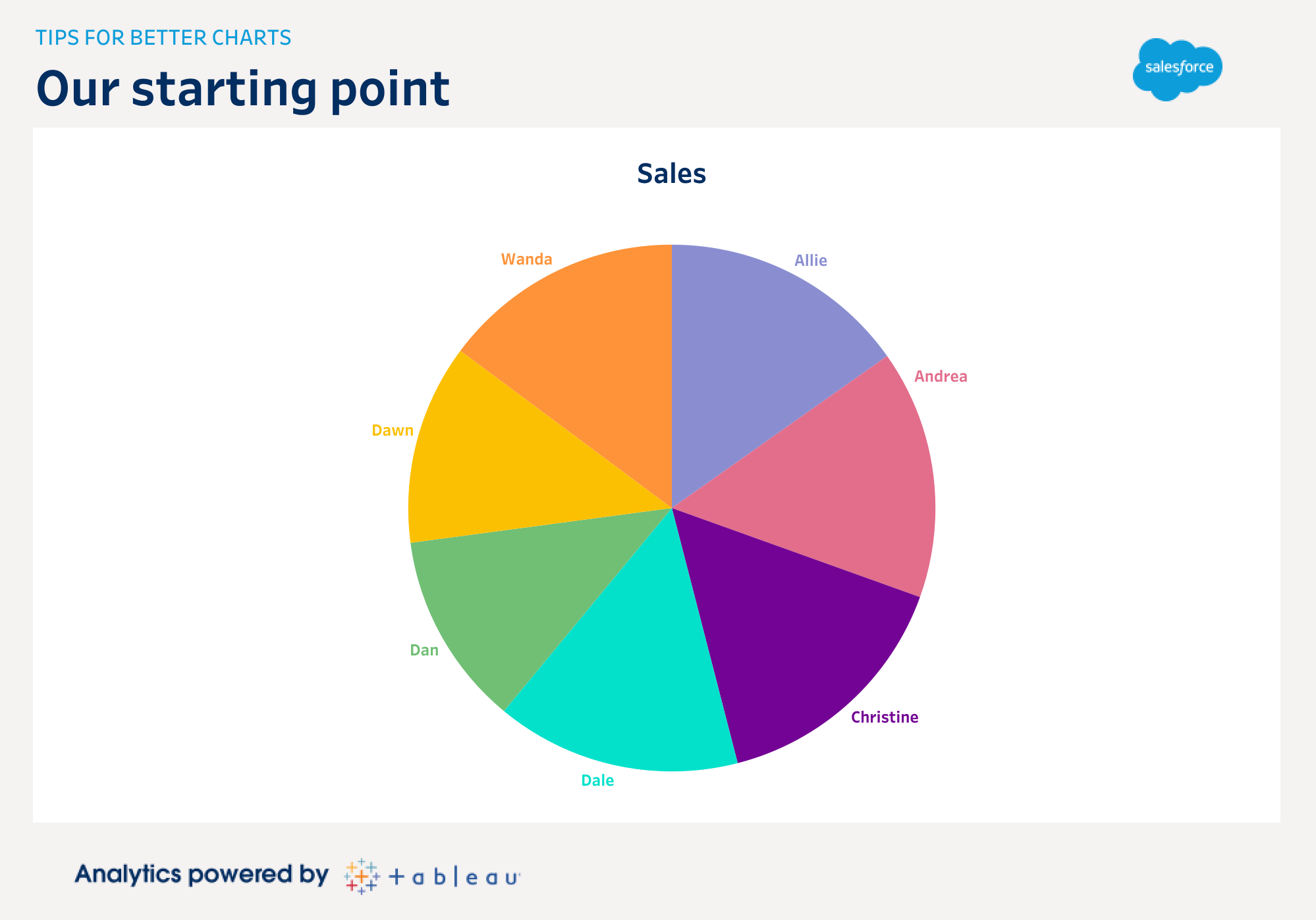
In this post, I’ll share my top tips that will help you improve any chart. Each one represents a core aspect of data literacy skills. This list could also form a checklist you can use whenever creating charts to be sure you’ve made something that will work for your audience. I’ll show the tips by making incremental changes to a typical chart you might find on any dashboard. Below is our starting point, an everyday pie chart:
Tip #1 – Avoid the pies!
Pie charts are everywhere. Humans love circles, but here’s the bad news: pie charts are rarely useful. Consider our example above. Which person has the biggest sales? It’s hard to answer the question, right? Let’s apply our first incremental improvement, and switch to a bar chart:
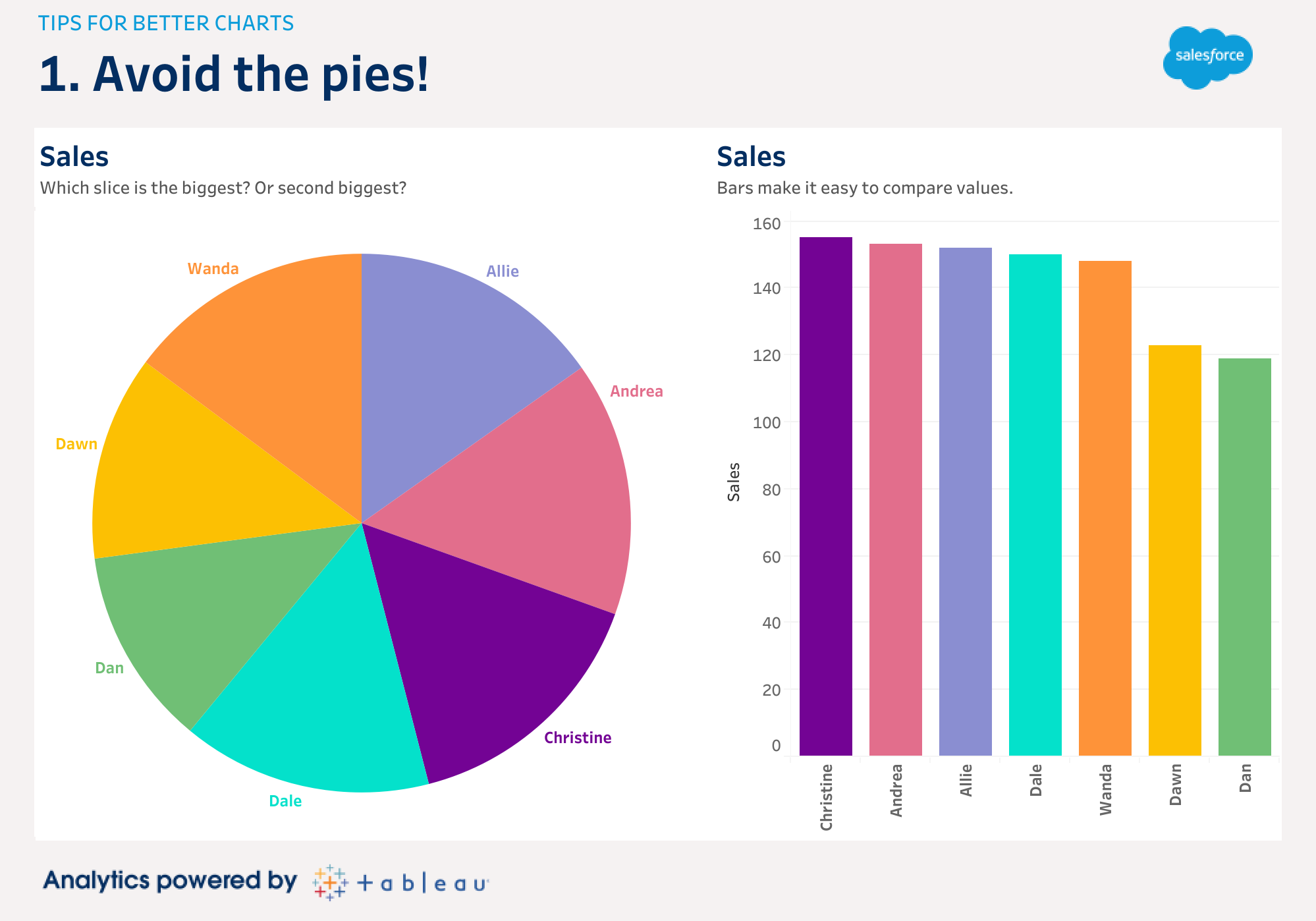
It’s not only easier when the data is shown in bars, your brain efficiently processes the bar chart on the right before you even consciously think about the data.
How can that be? Data visualization takes advantage of “preattentive attributes.” These are environmental signals that we process subconsciously, and they’re super-useful. Length, color, size and angle are all examples. However, we process some more efficiently than others. Our brain is terrible at efficiently comparing sizes of slices in pies, but wonderfully efficient at perceiving even small differences in lengths.
A chart should deliver its message in the most accurate way possible. Choosing the right preattentive attribute is a critical skill. Don’t just click the button that makes the most “attractive” chart. You should always think about whether the chart actually conveys the message you want it to.
Tip #2 – Avoid distractions (aka, “don’t make me tilt my head!”)
Your goal when making charts is to reduce the cognitive load on the audience as much as possible. How many times have you seen a chart with the labels rotated vertically? I see it all the time, most often on bar charts. Why not simply rotate the chart so the bar is horizontal?
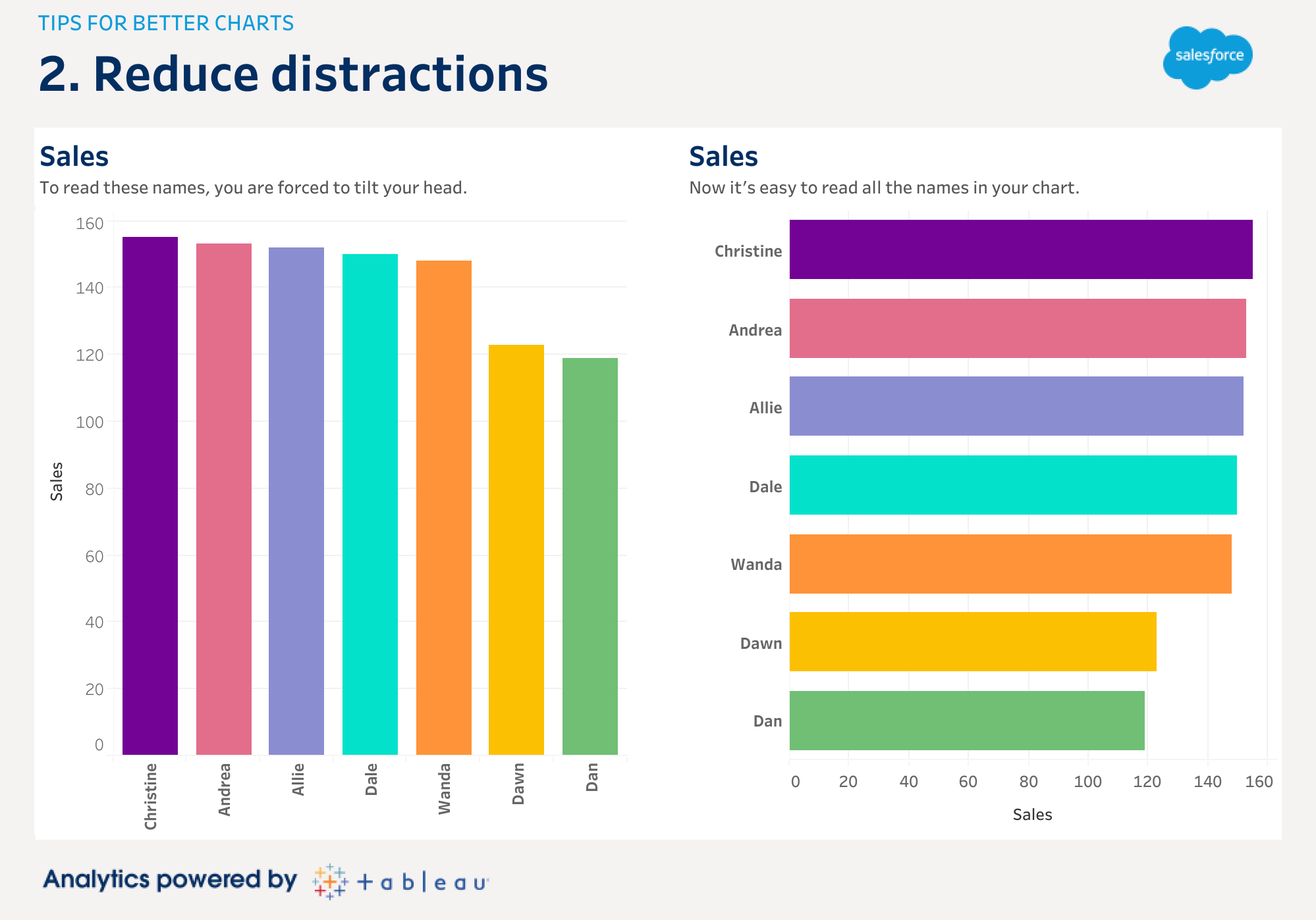
Making these incremental changes helps people to get to the insight more quickly because they can focus on data, not formatting. Other distractions that often clutter charts are excessive gridlines, intrusive axes or borders, or the use of three dimensional charts.
Tip #3 – Use color with intent
Avoid the temptation to use too many colors in your visualizations. In all analytics software, colors are just a click away, and it’s easy to feel productive by sprinkling some into your charts.
Take a step back. Is the purpose of your analytics to make pretty rainbows, or to share insights?
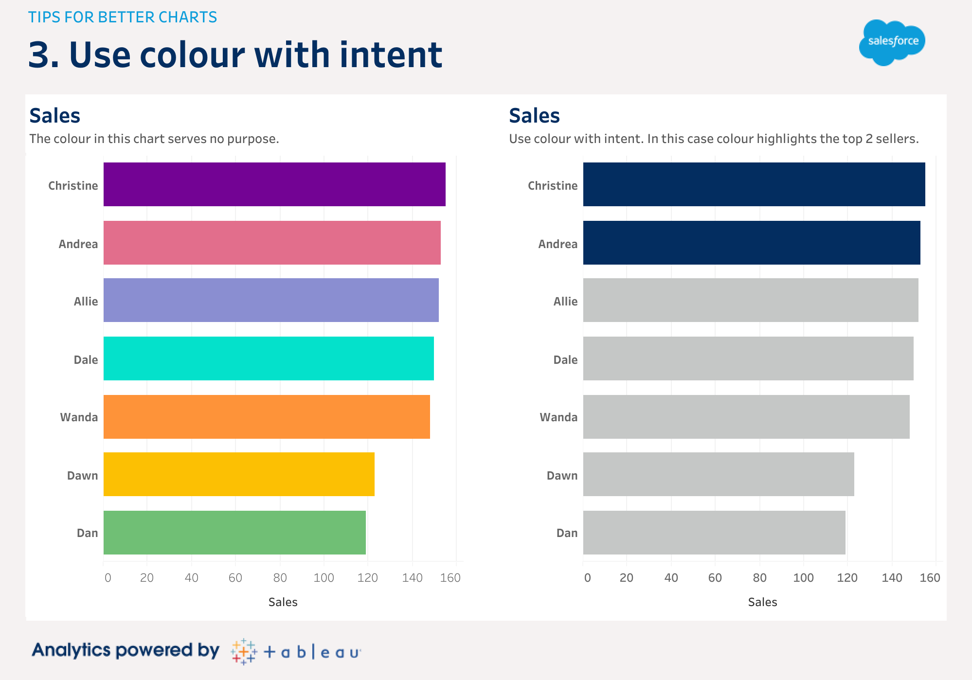
Some of the most powerful and effective charts use only one color. In the below example, the multi colors used on the left serve no purpose. Readers might be confused as to what the different colors even signify. The example on the right is more effective in highlighting the intent, which is identifying the top two sellers.
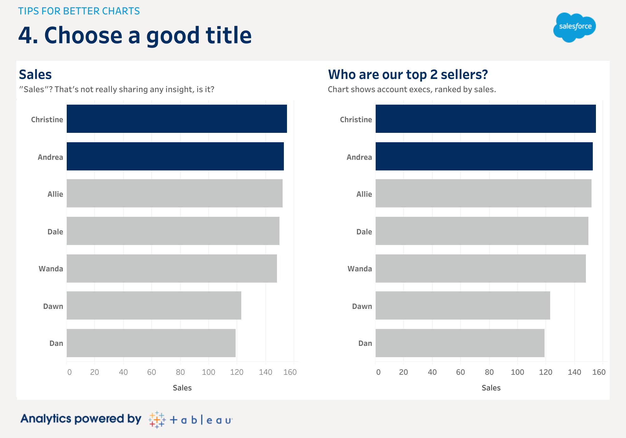
Tip #4 – Choose a good title
After choosing an appropriate chart, orienting it correctly, and using color to highlight, you need to stop and think: what is this chart actually showing? What conclusion do I want people to draw from this chart?
The first thing people look at on your chart, and the most likely thing they’ll remember, is the title. It’s the one chance you get to tell them what they’re going to see and suggest the insight you want them to take away. A good title should describe the insight the chart shows; this could be in the form of a short phrase, or even a question. Getting in the habit of making good titles also forces you to be sure you know why you are making the chart in the first place.
In this example, I’ve created an effective 2-level title on the right. This allows a clear intro (“Who are our top 2 sellers?”) with a sub-heading for added context.
Tip #5 – Show the right number
My final tip is possibly the one you should consider first. Are you even showing the correct number to your audience? So far, we’ve been looking at sales by Account Executive. It looks like Christine and Andrea are our leaders. However, sales success is measured against a quota, not the actual sales value themselves. Have we been charting the wrong number all this time? Let’s take a look at the data:
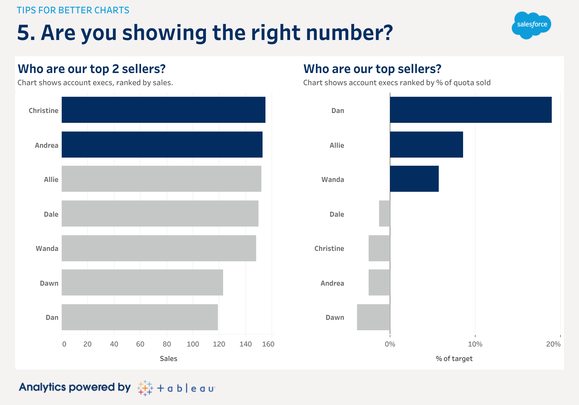
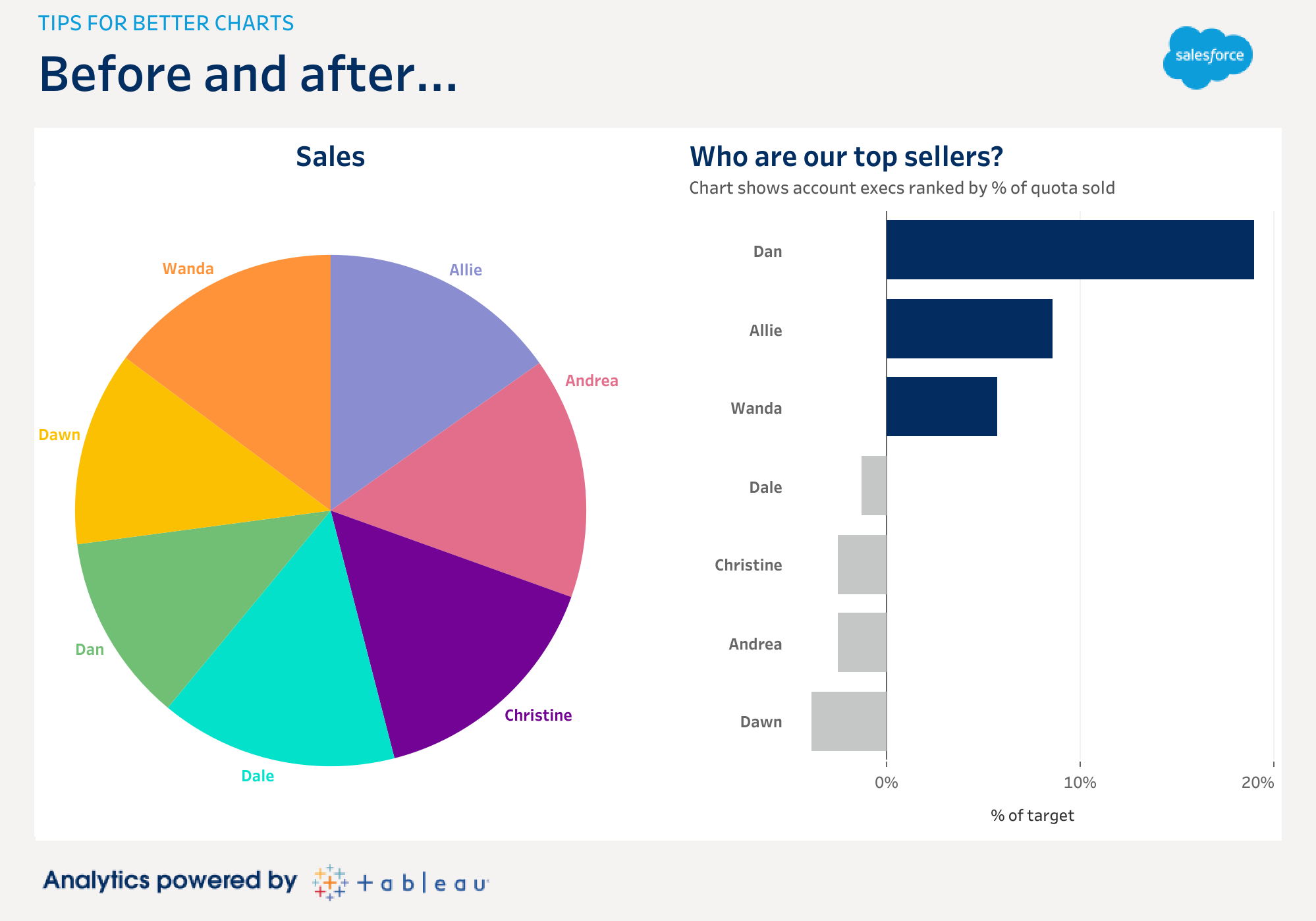
We can see Christine and Andrea sitting atop the table, but look across to the target and percent of target values: they’re behind their quota! Perhaps, then, we’ve been visualizing the wrong value all along. Let’s take a look at the account execs ranked by percent of target. It turns out that Dan, Allie, and Wanda are the superstars who are above quota. Dan’s way ahead, even though his actual sales value is the lowest in the team.
These tips will help improve your charts, but they are just the starting point. You can accelerate your learning by joining thousands of other data-inspired people in our Tableau Community. If you want to see more of my tips, tricks and thoughts on data literacy, follow me on Twitter or join my Sweet Spot newsletter.
