You know accessibility is important to app design, and that what’s essential for some is useful for all. Still, how and where you start with accessible design can be daunting. That’s why we put together four entry points that anyone can try. Remember to begin where it makes the most sense for your organization.
What is accessible design?
Accessible design is a practice that provides users with options and features to engage with technology in various ways, across platforms and devices. Here are some suggestions for ways you might approach addressing web accessibility in your apps:
- Understand needs for accessible design.
- Choose accessible colors and color contrast.
- Prioritize keyboard accessibility in your app design.
- Co-design apps with users who experience exclusion.
Accessibility guidance for SLDS
The Salesforce Lightning Design System provides accessible markup which will serve as a foundation for your application development.


1. Understand needs for accessible design
The Web Content Accessibility Guidelines (WCAG) include a first review of accessibility called Easy Checks. It highlights top aspects to evaluate from modes of interaction to sizes of text.
There’s a human need behind each of its itemizations. For example, people using your app may not be able to read text that’s too small. Others with photosensitive epilepsy can have seizures if content moves, flashes or blinks more than three times in one second. And think about people who use screen readers. It’s easy to understand how some people might be excluded.
The examples of what would pass and fail are particularly useful in Easy Checks. Compare your existing designs for a high-level understanding of compliance. Then take your findings and share them with someone at your organization who can fix accessibility barriers.
For 25 years, WCAG has been the main international standards organization for the Internet. Its goal? To help everyone build a web based on the principles of accessibility, internationalization, privacy, and security. The keyword here is everyone.
2. Choose accessible colors and color contrast
Many people can’t read text if it’s on a background in a similar color. This impacts more people than you might think. According to a 2023 World Health Organization (WHO) report, there are over two billion people who experience vision impairment. So, we need to think differently about color usage in app design.
Designers must be intentional about how to pick colors, because many factors go into it. Think about the meaning a color conveys. “A meaning can be emotional, for instance, red means prosperity, but it also means stop.”
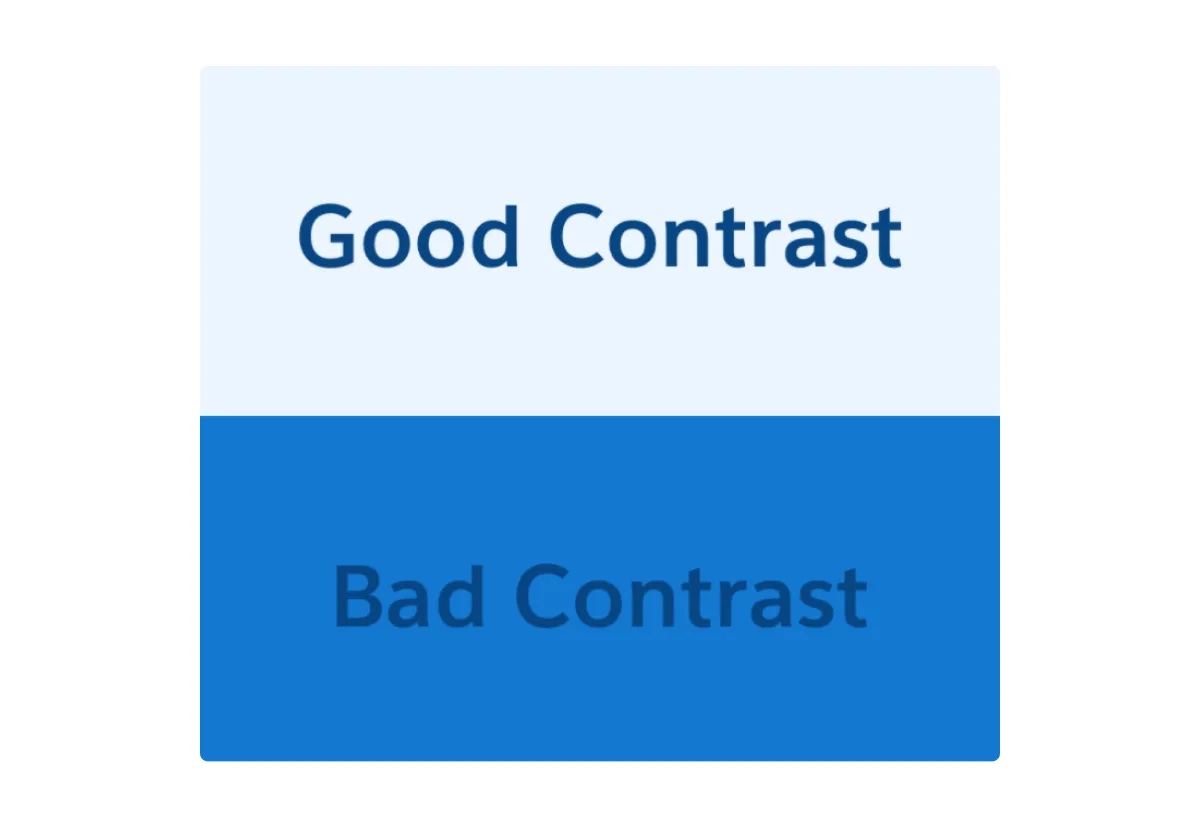
It’s also essential to consider if a set of colors is accessible. Is the text legible to everyone or just some? A high contrast ratio makes it more possible for people with impairments to engage with your app.
For users with no or low sight, it’s critical that app designers distinguish both text and non-text objects with contrast. Either meet or exceed the minimum WCAG text requirements.

Further, while color is a core building block to any design system, it cannot be the sole way to convey meaning or functionality. Other communications take the form of text-based indicators, icons and height and width changes.
Color usage is one part of visual considerations. Additionally, expand your scope to the navigation of your app.
3. Prioritize keyboard accessibility in your app design
Some users navigate sites with a mouse. Others use equipment such as screen readers. Keyboard accessibility is a practice designers rely on to ensure anything that can be done with a mouse can be done with a keyboard.
There are a few ideal moments in the design process to continually have this conversation. There’s the early stage (framing, defining, aligning), the mid stage (building) and the final stage (testing).
In a recent conversation about alternate forms of navigation, Trailblazer/MVP Eric Smith put it best. “You want to make sure that you’re not putting something in place that will restrict somebody – whether that’s an application or an interface you’ve created,” he said.
You really don’t want to exclude anybody if you can help it.
Eric Smith
Trailblazer and Technical Architect
Keyboard accessibility is personal to Smith, whose sister-in-law uses a screen reader. He also developed an open-source component with Salesforce custom labels that allows it to be recognized by users navigating with a keyboard. As an added benefit, these labels enable quick translation into multiple languages. “You really don’t want to exclude anybody if you can help it,” he said.
Accessible design is top of mind in his work as a Technical Architect at digital ecomm services firm RafterOne. “I think it comes down to common sense,” he said. “I always find I have the Salesforce Lightning Design System documentation (for Keyboard Interaction Accessibility Guidelines) available and up when I am creating something.”
Designers appreciate differences – whether that’s how we see things, how we navigate or how our minds work.
4. Co-design apps with users who experience exclusion
We all process things in their own way – whether neurotypical or neurodivergent. Designers can take this into account. People with autism may benefit from the ability to modulate screen brightness to ease sensory sensitivities. And, those with dyslexia might find shorter, bulleted phrases easier to understand than paragraphs.
Designers uncover these needs by being in conversation with their users. Co-designing invites users into the creation process.
On a recent project, designers at Salesforce collaborated with users who have Attention Deficit Hyperactivity Disorder (ADHD) and anyone easily distracted by cluttered user interfaces. They wanted to make it easier for them to focus on what to do on each screen.
Designing for focus requires separating the foreground from the background. When the Sales Cloud team applied inclusive design to in-app guidance, users were more likely to succeed.
Be an accessibility champion
At Salesforce, maintaining customer trust includes committing to product accessibility and encouraging our partners to do the same.
Today, it’s more likely than ever that your organization has executive buy-in. According to a 2023 Forrester survey, 60% of companies have “top-down” support to build accessible products, and 65% of software decision makers report they’re implementing accessibility testing tools. So there’s no better time to begin your journey toward inclusion.
From business leaders and independent software vendors (ISVs) to marketers and designers, everyone can influence what gets shipped.
Accessible app design is one way to make a more inclusive world, improve the user experience for everyone, and attract new users.
Today, users can find accessible apps more quickly in AppExchange, the leading enterprise cloud marketplace. Any app that links to an Accessibility Conformance Report will be included in the new Accessible filter search results.
Ensure yours is on the list. Everyone can be an accessibility champion.


